
With smart copy and design that maximizes those word choices, you have a better chance to draw that necessary immediate interest, straight out the mailbox.
The written word is the most powerful response driver for a direct mail campaign. Evocative words and phrases that dial into a reader’s emotions can make a powerful impression and encourage them to act.
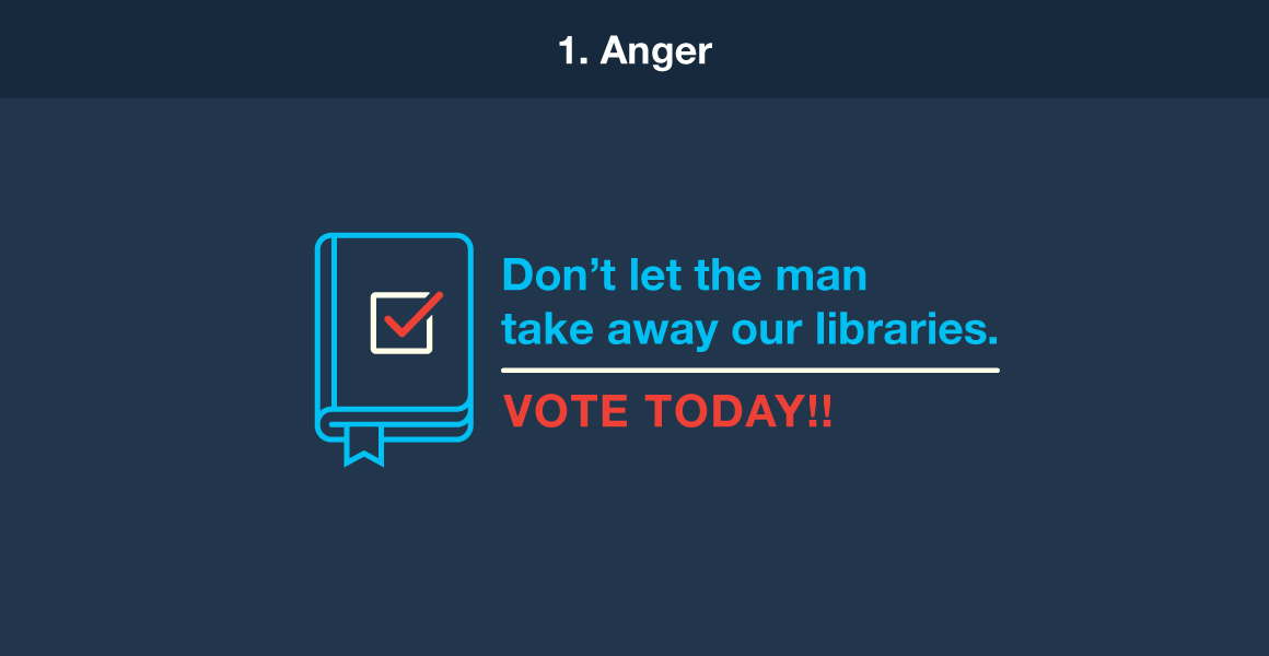
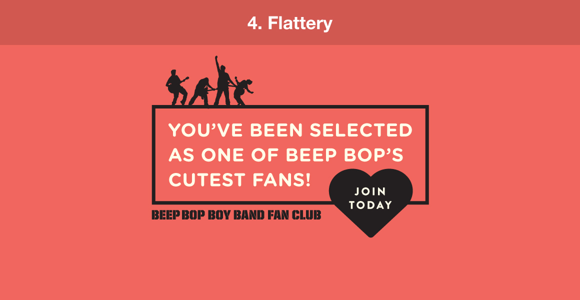
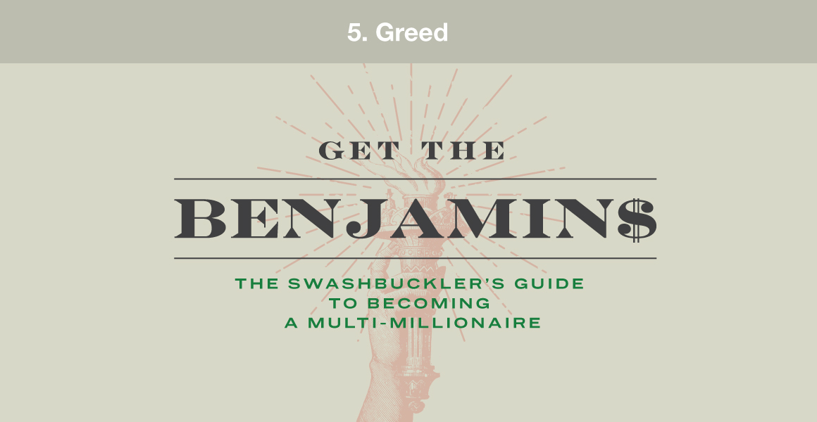
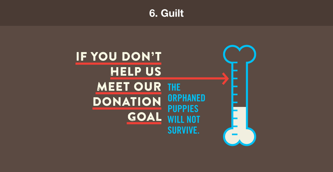
Direct mail experts have identified seven key copy drivers to help determine your writing’s emotional approach. Swedish entrepreneur Axel Andersson and Seattle direct marketing guru Bob Hacker originally defined these seven key copy drivers, and copywriting expert Denny Hatch expanded upon them in his book Secrets of Emotional, Hot-Button Copywriting.



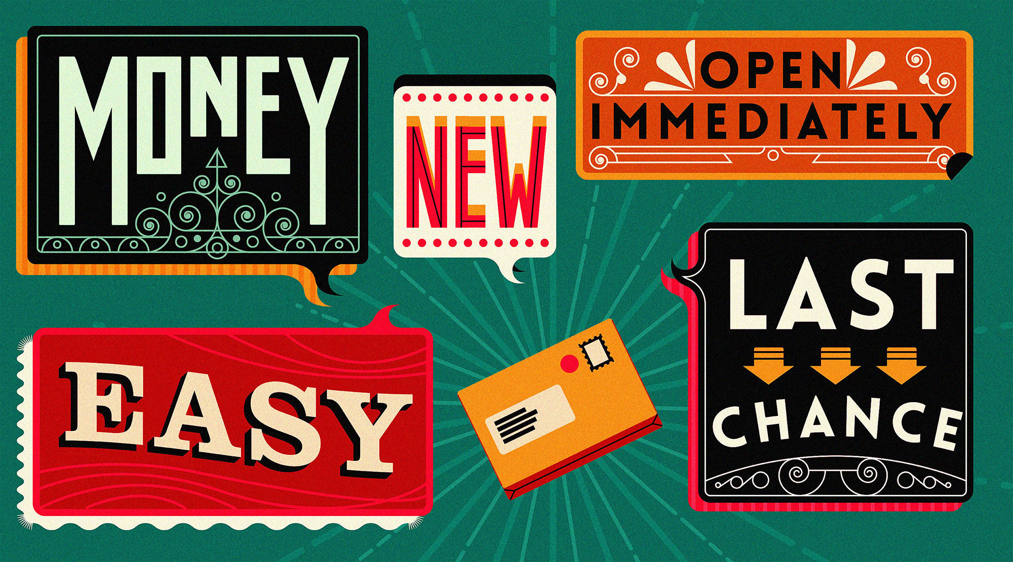
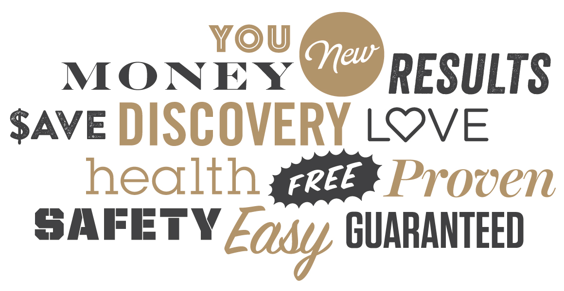
According to direct mail expert Denny Hatch, these are the most evocative words in the English language.
No matter what key copy driver you choose, you still need to put that message into the words that will make your customers actually want to read what you’ve written. When crafting direct mail letters, award-winning copywriter Pat Friesen, author of the Cross-Channel Copywriting Handbook, advises the following guidelines to achieve maximum readability.

Short words
75 to 80 percent of your words should be five characters or less.
Short sentences
Sentences should be one-and-a-half lines or less.
Short paragraphs
Paragraphs should rarely exceed six lines.
Typography, layout and hierarchy basics can help your copy stand out too, ensuring your message is easy to read and understand.
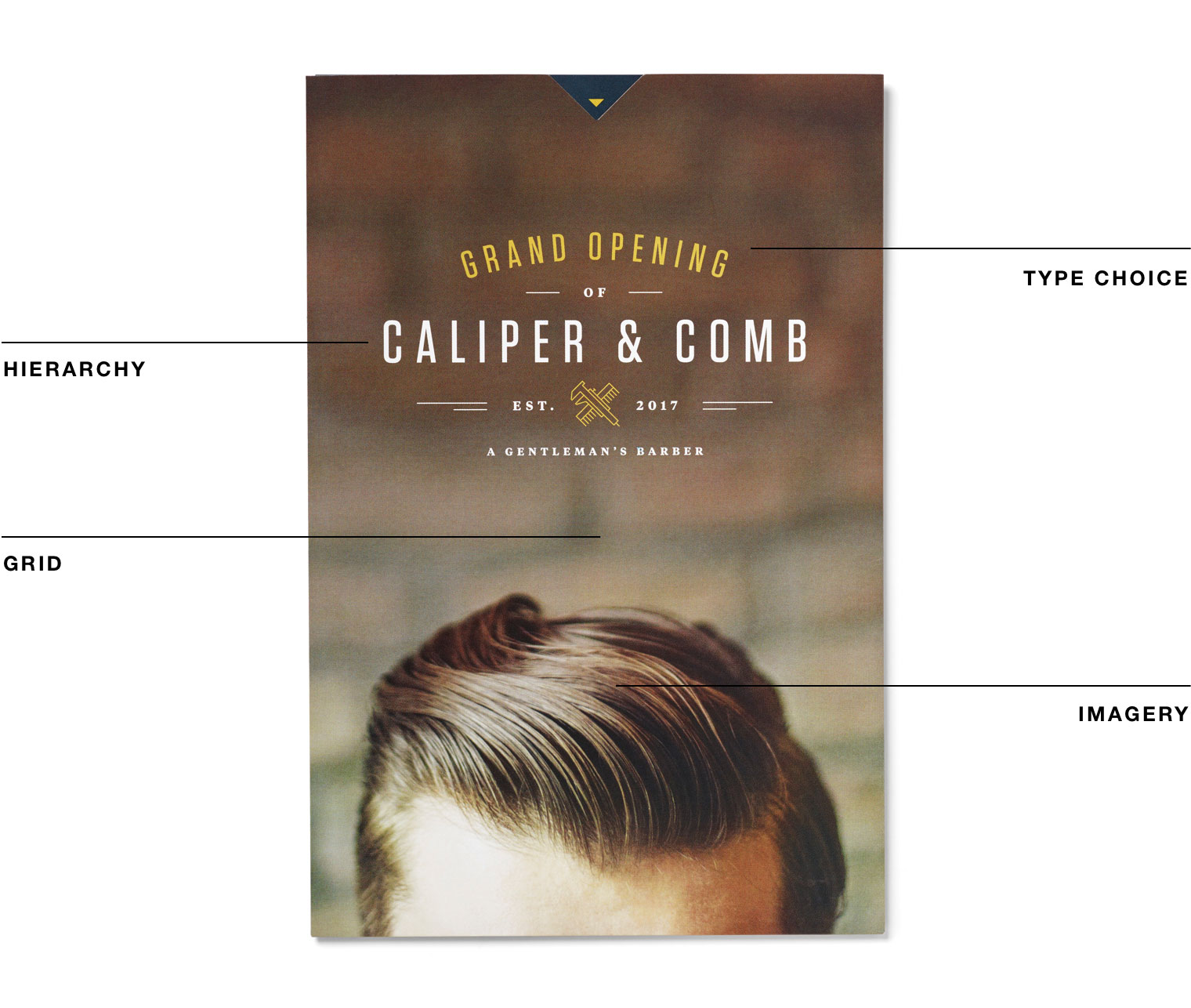
Type choice
For a coherent message, select a font that’s legible and time-tested. To enhance readability, use the most common type alignment: flush left, ragged right. Avoid all caps and script fonts, as well as small and reverse white text, all of which can be hard to read.
Imagery
Make sure the image you select not only supports your concept, message and format, but strengthens them as well. For printed pieces, remember the resolution must be high to ensure readability of text on an image. This is also an opportunity to use variable imagery and batch target your audience.
Hierarchy
Determine an organizational system for content that emphasizes some data over others. This prioritizes your message and lets readers scan text. Use one or two cues to signal your hierarchy, like font size, weight or color.
Grid
Arrange content in a grid. Elements that align with one another feel more harmonious and are easier to read. White space can also help emphasize your message.
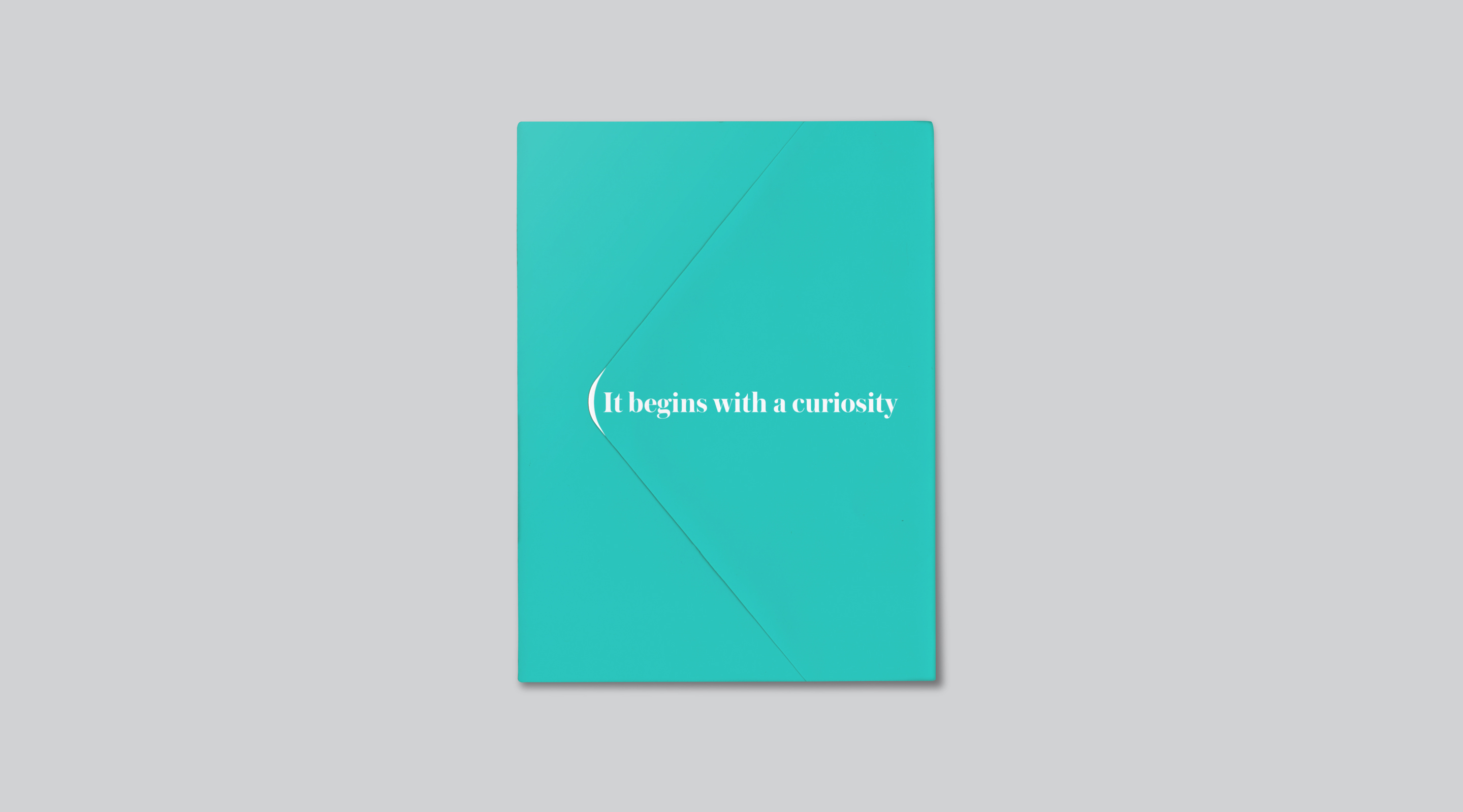
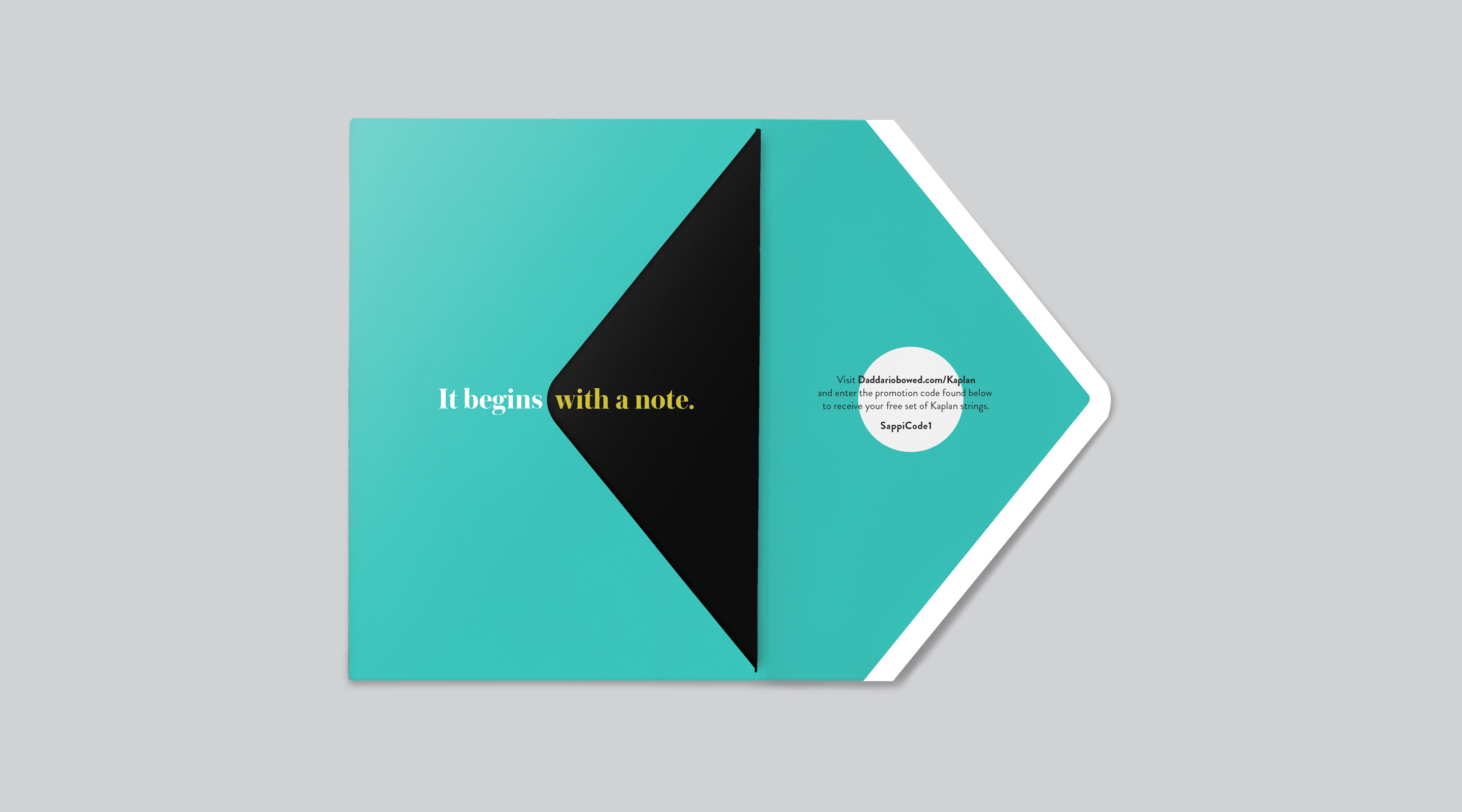
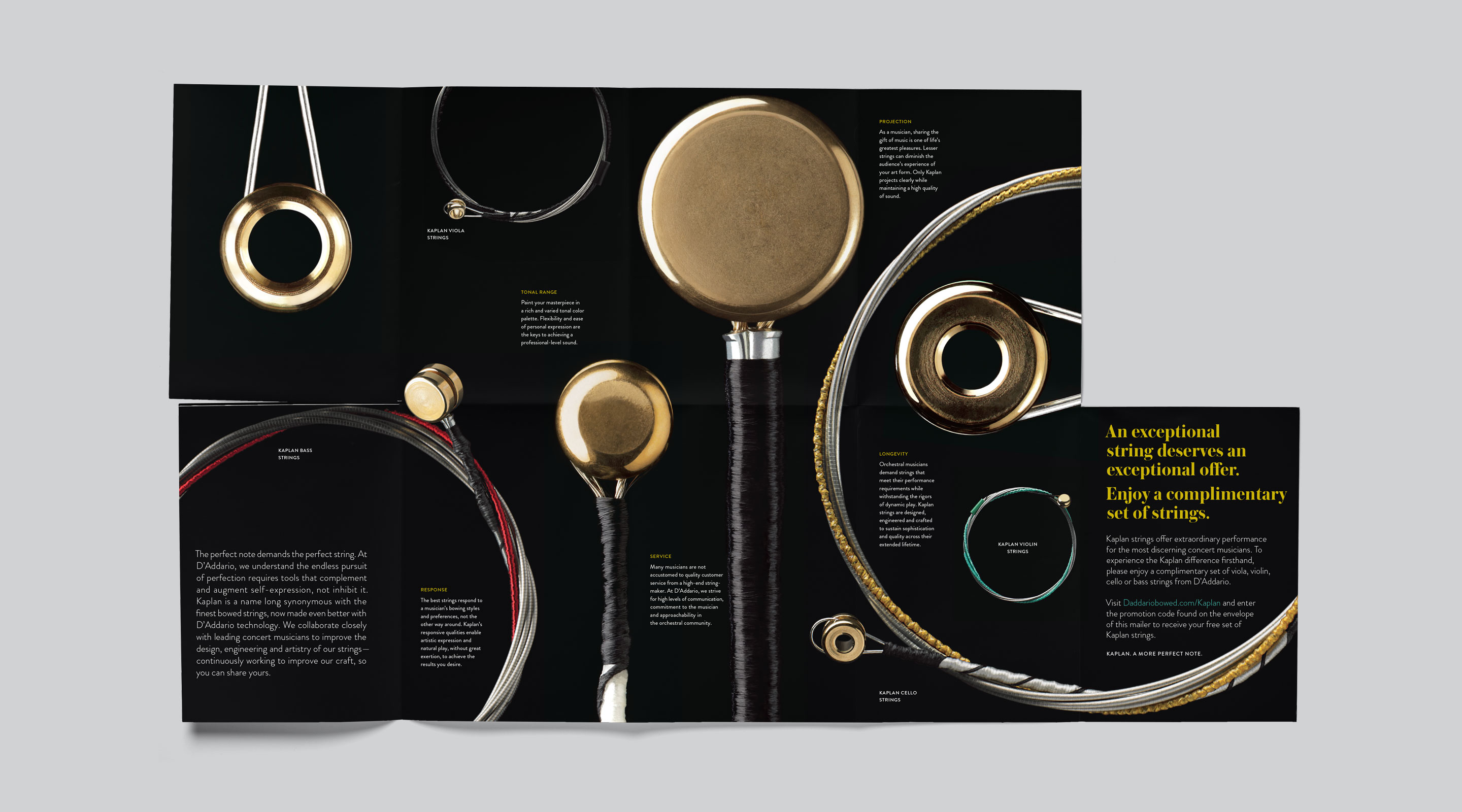
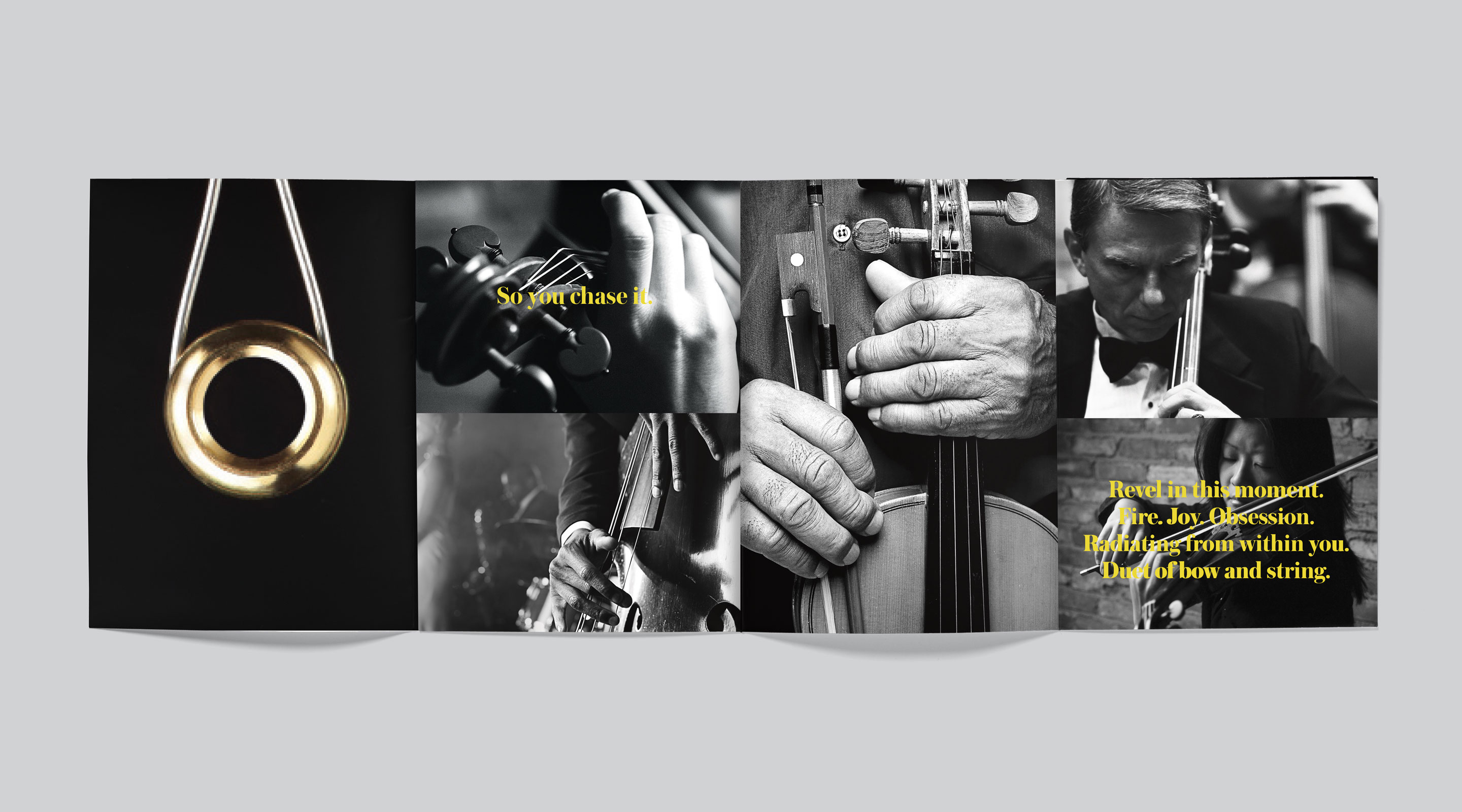
To make a personal connection and help customers understand that D’Addario music company is at the forefront of orchestral string design, this direct mail campaign pairs explanations of Kaplan strings’ superior performance with intimate portraits of musicians. Evocative, dramatic language and high-end printing techniques demonstrate the strings’ sophistication that you need to hear to believe.
Inventive designs and catchy copy will draw your customers in, but employing the right paper is equally important.
Get samples to see how our web covers are up to 50% smoother than the competition.
